
Granular Overview
Granular is a SaaS enterprise software company building farm management software for farmers. The product covers everything from operations, financials and inventory to reporting and analysis.
When I first started at Granular, there were no design tools or resources. It was a 20 person startup that had a Beta application and the product team was just beginning to launch the first paid version.
UI Toolkit
Define Why
There are no documentation or tools for the design team to quickly create mockups in Sketch. Designers will sometimes spend thirty minutes just trying to find assets for a design because they are forced to dig into Google Drive, download another designers’ Sketch file and pan through until they find the icon they had it mind. Due to this, there is a high likelihood of inconsistency, confusion and time wasted that should be avoided as the team grows.
Requirements
Build a UI Toolkit for designers to utilize that provides all standard assets. Develop a process to review and approve new assets that have not been defined or are different than existing standards.
TO NOTE
I did not create the original assets within this toolkit. I helped to define existing assets and was involved in adapting the library as the product was being built.
MY ROLE
Lead designer - discovery, research, UX/UI design documentation
Research
The organization of this tool was based off of Atomic Design Methodology developed by Brad Frost.

I researched other online and sketch toolkits to gain more insight into what worked well and what did not.
Teehan and Lax
Bootstrap
AirBNB


Implement
Granular’s UI Toolkit organizes elements from small to big, referencing Atomic Design. It includes art boards for a designer to quickly mock up and annotate. Designers can quickly grab icons, tables, drop downs, etc. and be sure that they are standard and therefore, not have to worry about things like color or size. The toolkit includes details and rules regarding the UI or UX of assets. A new designer could quickly onboard and understand the UI used in the application.
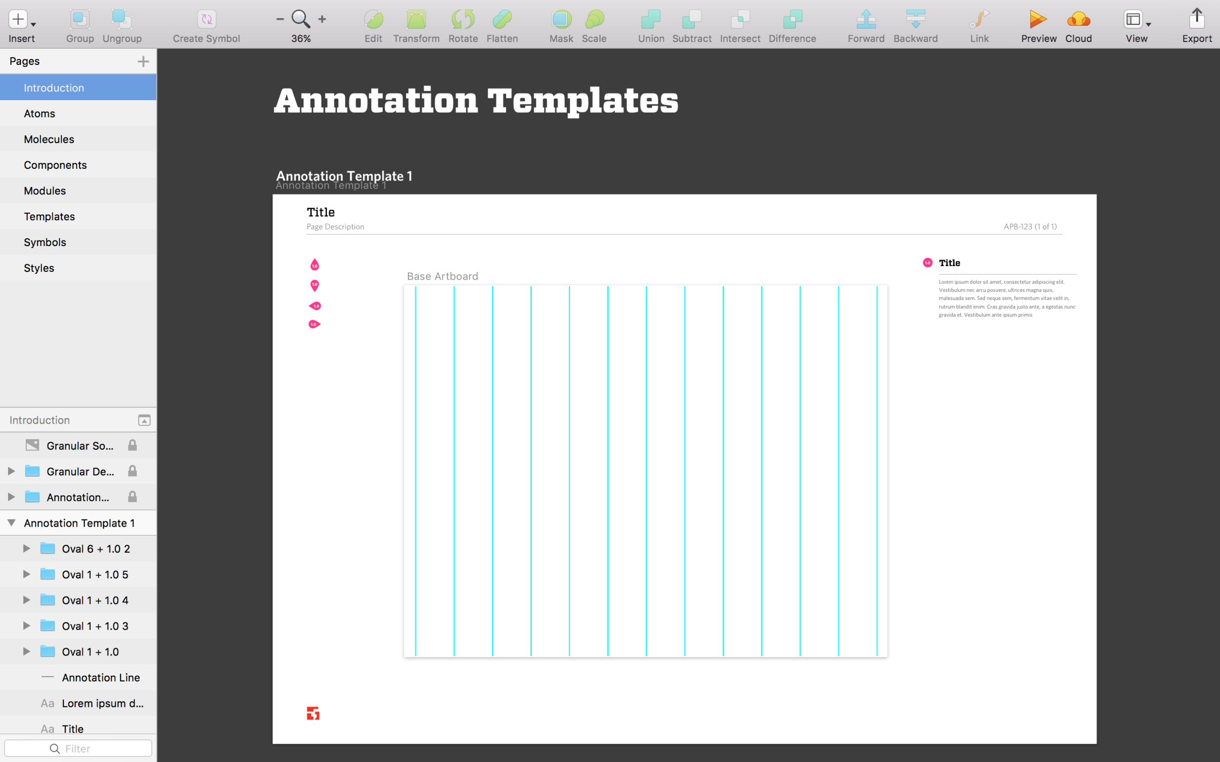
Designers could easily begin their design and create quick annotations to share with team.


Monitor
This tool saved an enormous amount of time and allowed the team to discuss and agree on design standards. Designers no longer wondered if body copy should be 14 or 10 points. It was a lightweight tool to allow the team to move much faster and more consistently.
I worked collaboratively with the design team and engineering to ensure that we were standardizing and communicating designs in an optimal way. Eventually, I helped engineering build their own toolkit which this Sketch documentation helped to inform.