
Granular Overview
Granular is a SaaS enterprise software company building farm management software for farmers. The product covers everything from operations, financials and inventory to reporting and analysis.
Setup Optimization
Web Project
Define Why
The CEO of the farm sits down with a customer service representative to get set up in Granular. This process takes, on average, one month. All of the set up pages have slightly different experiences which creates inconsistency and a lengthy on-boarding process.
There are many opportunities to update the entire experience to ensure the user gains insight after the first day. However, this project had buy-in because engineering was switching their code base at the time.
MY ROLE
Lead designer - discovery, research, UX/UI design
Research
I went through all of the Setup pages within Granular’s web app experience and documented the different page structures and systems.
One add button & grouped table User selects type from a dropdown in the modal and that entry gets placed into the correct group.
One add button & multiple tabs User selects type from a dropdown in the modal and that entry gets placed into the correct tab.
One add specific to the tab User can add only add a selection from the category specific to the tab.
Add drop down & grouped table User can add from dropdown list to open up the correct modal which is then placed into the correct group.
1. One add button and grouped table

2. One add button and multiple tabs

3. One add specific to the tab
4. Add dropdown and grouped table
Information Architecture Assessment
All of the Setup pages have the same composition but work slightly differently. I categorized the content within the pages to understand their information architecture. I found that all pages had 2 or 3 levels of information which I defined as Category, Sub Category and Item. I assessed how different UI elements such as tabs and grouped tables can be used based on the definitions I set in place.
Examples
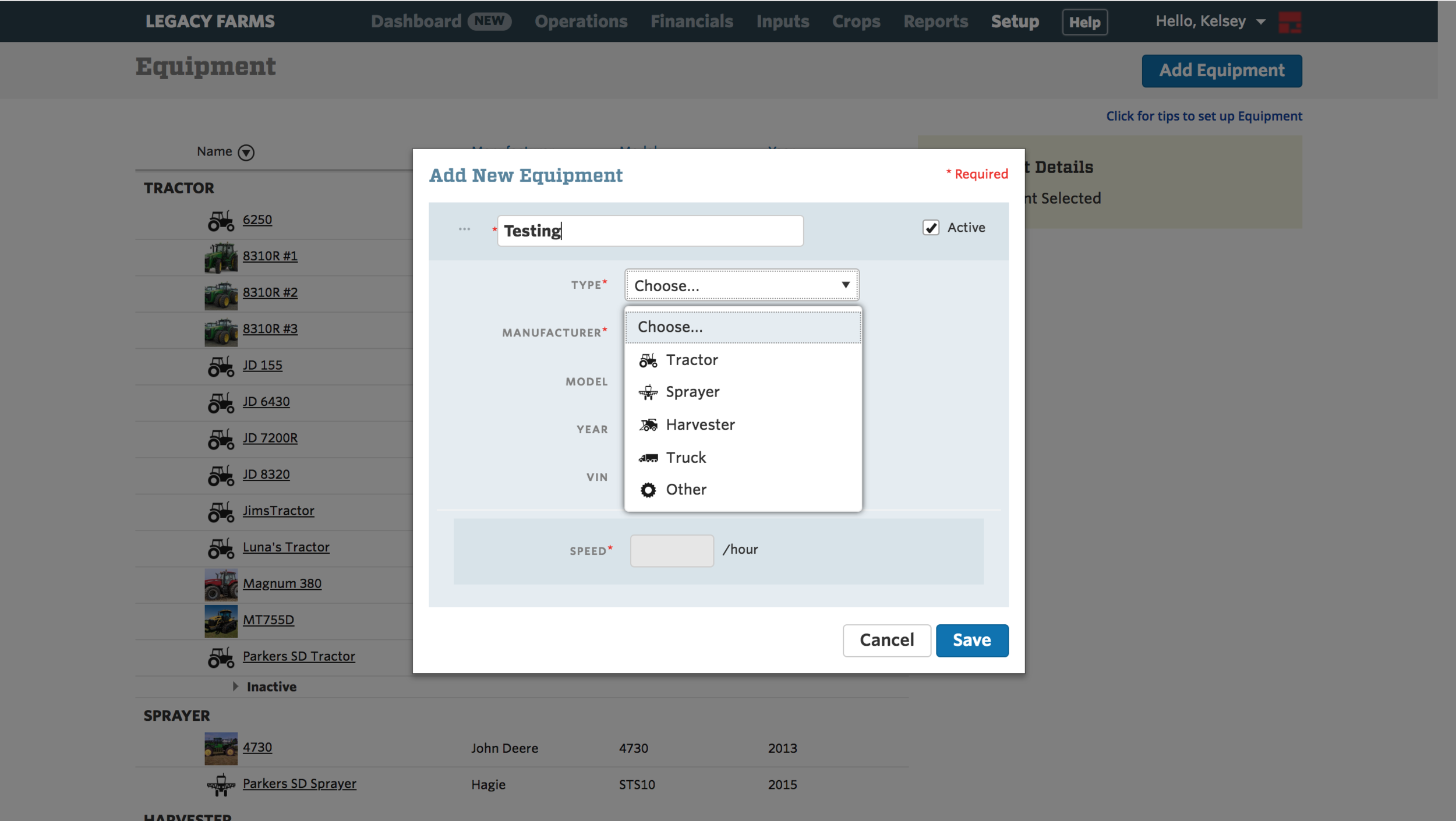
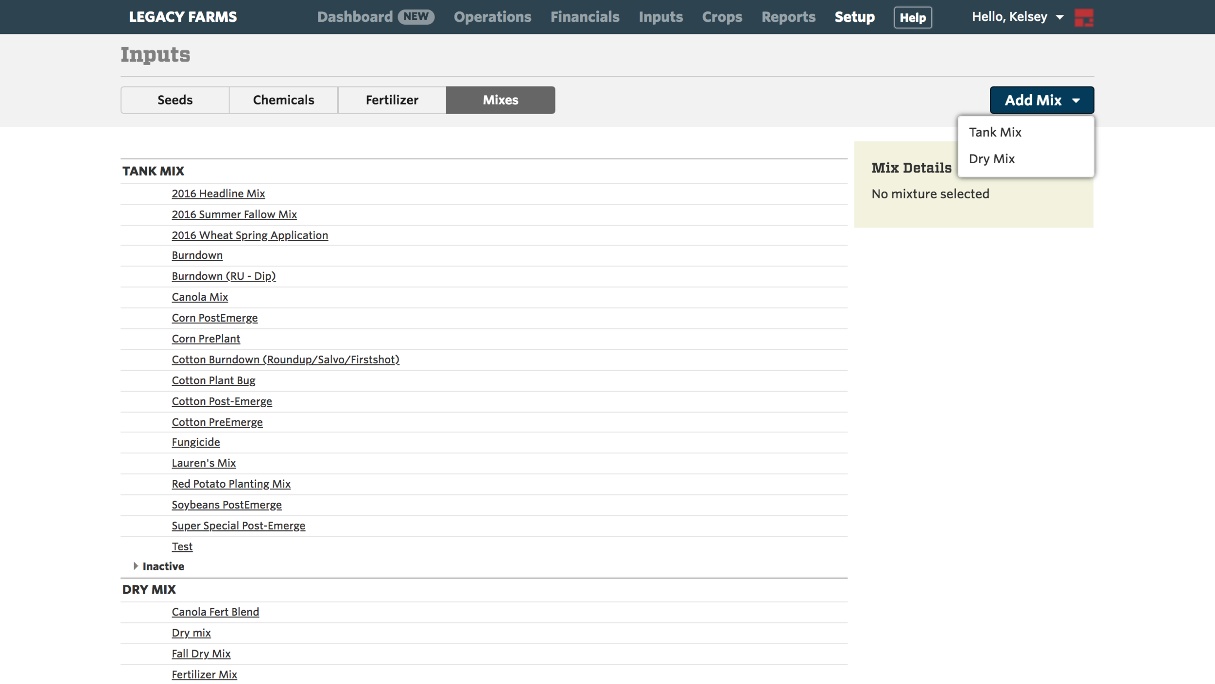
Inputs Page
Category: Seed, Chemical, Fertilizer and Mix
Sub Category: Crop Type, Fungicide, Insecticide, Tank or Dry Mix
Item: RoundUp (specific name of fertilizer)

Category, sub category and item = tabs and grouped table
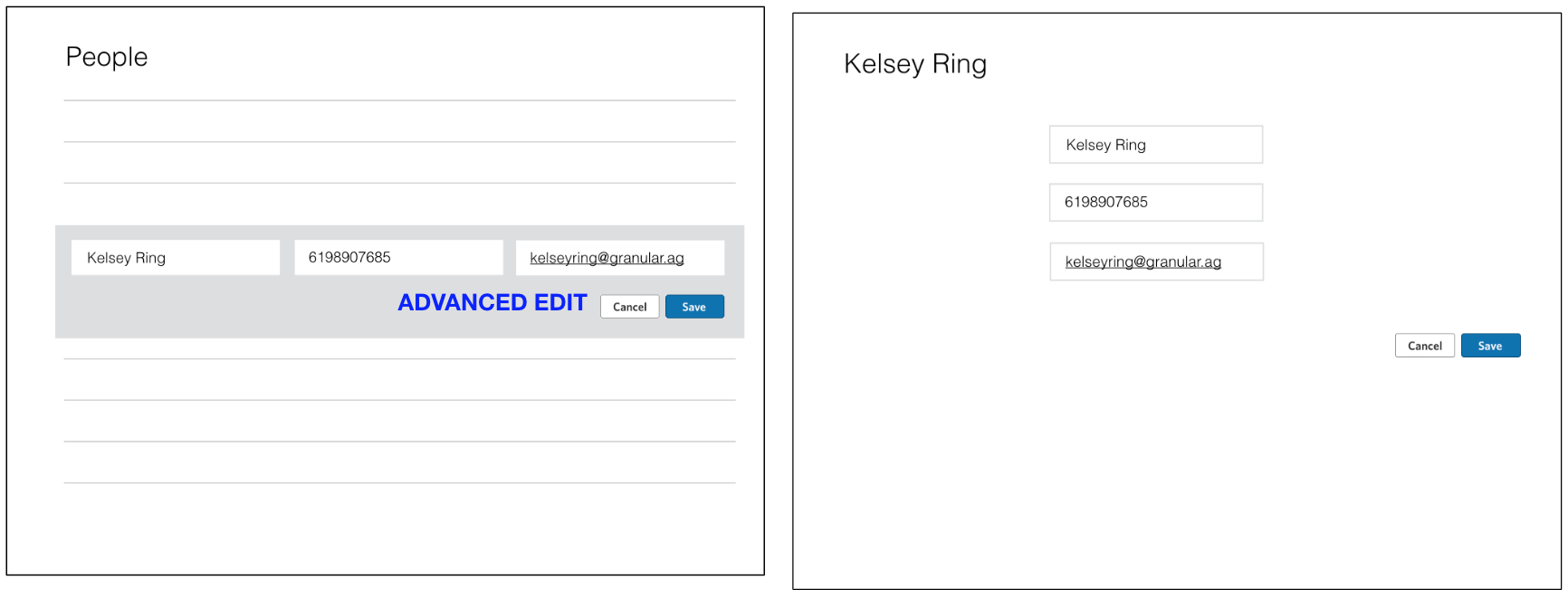
People Page
Category: Operator, Manager and Administrator
Item: Kelsey Ring

Category and item = grouped table
Rule
If a page has a Category and Item, show within a grouped table.
If a page has a Category, Sub Category and Item, show a grouped table within tabs.
Ideation
These explorations addressed an opportunity for a more streamlined experience for the user. To edit within the existing designs a user will have to follow the following steps: 1. Click on an item in the table 2. Select the edit button in the side rail 3. Make edits in a modal 4. Click Save. I wanted to explore ways, using UI, to remove a step and create a better experience for the user across the Setup Experience.
1. Editable Side Rail
2. Bread Crumbs
3. Modal
4. Inline Add
5. Card Layout
6. Easy to Advanced

1. Editable Side Rail

2. Bread Crumbs

3. Modal

4. Inline Edit

5. Card Layout
6. Easy to Advanced (Exploration #3 + #5)
Test and Iterate
I discussed these explorations with the design team and opened up the conversation to assess the explorations and collaborate on more ideas. I involved the design team early on because this project affected an entire system within the app. I wanted to ensure I made use of other ideas and ultimately got buy-in on the direction.
Implement
I moved forward with the proposal for the information architecture. The tables were grouped and only introduced tabs if a page had another layer of information which helped navigate and create consistency across the entire experience.
The page structure I moved forward with was “Easy to Advanced.” Most items added in Setup are set up once and forgotten. If you need to edit something, most likely, it is a phone number or name rather than something more technical like permissions. Therefore, this design allows a user to edit a majority of the content inline and if the user wants to enter a more advanced experience the user can click into a modal.

Inline Edit
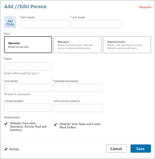
Advanced Modal