
Design Process
This document is structured based on a defined design approach.
Define > Research > Ideate > Test and Iterate > Implement > Monitor
Granular Overview
Granular is a SaaS enterprise software company building farm management software for farmers. The product covers everything from operations, financials and inventory to reporting and analysis.
As a designer, the most basic challenge initially was understanding farming and farmers to address their day-to-day challenges.
Mobile Application
Operators and Ops managers are the main users of the mobile app. Operators are on the lower spectrum for adopting technology. The mobile application is the operators’ only tool in Granular. Ops managers are more tech-savvy and use both the Granular mobile and web application.
Both the operators and ops manager are out in the field driving the equipment, spraying, planting, harvesting, etc.
The Granular mobile app has two main high-level use cases:
Communication: As an ops manager, I need to tell my operator to go plant Field A tomorrow.
Data Collection: As the CEO, I want the data collected in the mobile app to automatically sync to the web so that I can check on my financials, do analysis and run reports in real time.
Error Prevention
Mobile Project
Define Why
I created a spreadsheet to determine what to work on for the remainder of 2018. I collaborated with customer success and sales to quantify the impact every project would make. I created this list by sorting through customer requests and discussing with design and product.
MY ROLE
Lead designer - discovery, research, UX/UI design, animation

Super fancy spreadsheet I created to determine what to work on.

Existing Designs
Error Prevention
One of Granular's key values is providing insight into the financial aspects of the farm. To do this well, the data recorded must be accurate. In an analysis of data recorded on mobile, we found that approximately 5% of all input quantities recorded are off by a factor of 10 or more. Reducing these errors at the time they occur will have a dramatic, positive effect on the analyses performed later.
Based on data, the team and I decided to focus on the most common error in the application which is Rate and Total. There are two reasons why this input had the most errors:
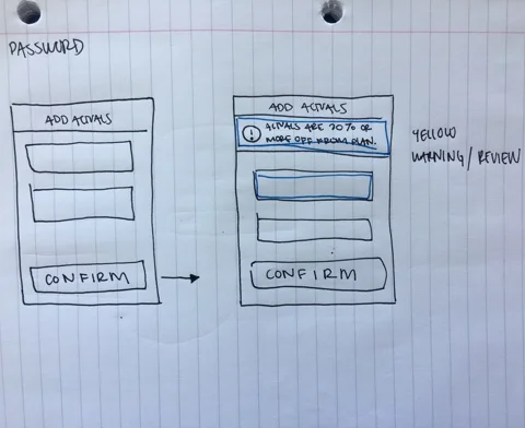
Toggle UI The toggle UI in the existing UI is unintuitive and therefore users enter the wrong data point. (i.e. Rate instead of Total.)
User “Fat Finger’s” If the user misplaces a decimal point or enters the wrong number while entering in data. This type of error is not exclusive to Rate and Total.
1. Toggle UI
As a design strategy, the goal for error prevention was to resolve the problem before it occurs. Therefore, it was important to resolve how the app surfaced Rate and Total to the user to avoid the confusion around what they are entering.
Ideation
1. Updated Toggle UI
2. Expose Both Rate and Total
3. Web Setup
4. Data Driven

1. Update Toggle UI

2. Expose Rate and Total

3. Web Setup

4. Data Driven
Test
After exploration, I created a research proposal and conducted user interviews to assess which direction was the strongest. I talked to 6 customer service representatives and reviewed the different approaches. I felt like this problem could be resolved internally and talked to this group rather than reaching out to operators directly. Customer service representatives work daily with users and have a lot of empathy and a deep understanding of their business.

Implement
“Exposing Rate and Total” as well as “Data Driven” were well regarded in AB research. I chose to move forward with Data Driven because of Granular’s design principle “Let common things be easy and uncommon things be possible.”

Final Designs
2. User “Fat Finger’s”
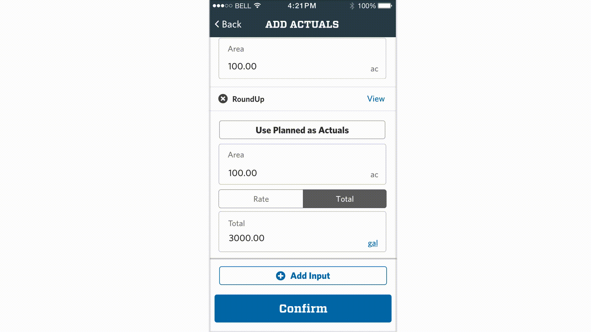
One of the mobile app’s main use cases is data entry so there are many inputs that the user can “fat finger.” Therefore, I wanted to insure that the direction for this solution would be scalable. The web application had a technical constraint which caused the engineers to wait a day until they could highlight errors to users. Therefore, I explored solutions that took place in real time as well as ones that highlighted multiple errors after the fact.
Ideation

1. Pegged at the top

2. Gamification

3. Status “Needs Review”

4. Pop Up
5. Inline Message
Implement
After assessing the pro’s and con’s of each exploration, I chose to move forward with “Inline Message” because it was the least annoying and the quickest way to resolve data being fat fingered. I ran this idea by CSMs and design during research for this project and this direction was extremely well received.

Flow charts to flesh out edge cases fro engineering.
Design Deliverables
Flow charts to flesh out edge cases and for engineering.
InVision prototype to communicate the step-by-step experience.
InVision Inspect to communicate UI annotations for engineering.
Keynote animation to depict how the inline message appears after the user confirms their actuals.